
Postgres development activity
Every now and then I need a break from writing code. In those cases I like looking at data about a subject I’m interested in - looking for trends, quantifying the expected effects, and so on. I needed just such a break a couple days ago, and I decided to look at statistics about the development activity of the Postgres project. So, here’s a bunch of charts (with a bit of commentary).
This is not the first time I’m looking at this topic. In 2024 I did a talk about the community, which included a couple charts about different parts of the whole community.
In this post I’ll focus on two parts central to the “development” side of the project. First, the pgsql-hackers mailing list, the place where patches are submitted and discussed. And the git repository, with the ultimate record of what got committed.
Don’t expect ground-breaking discoveries. If you’re participating in the development for some time, you probably have an intuition of how it evolved. This is more about quantifying the changes.
The mailing list archives start in 1998, the git history goes back to 1996 (but the first couple years are imported from CVS).
mailing list
The mailing list is the primary communication channel for developers (I like it, and don’t expect it to change soon). I think everyone agrees the number of messages grew over time - but how much?
Here’s a chart with the number of messages per day and per month (the per-month values make trends easier to notice):
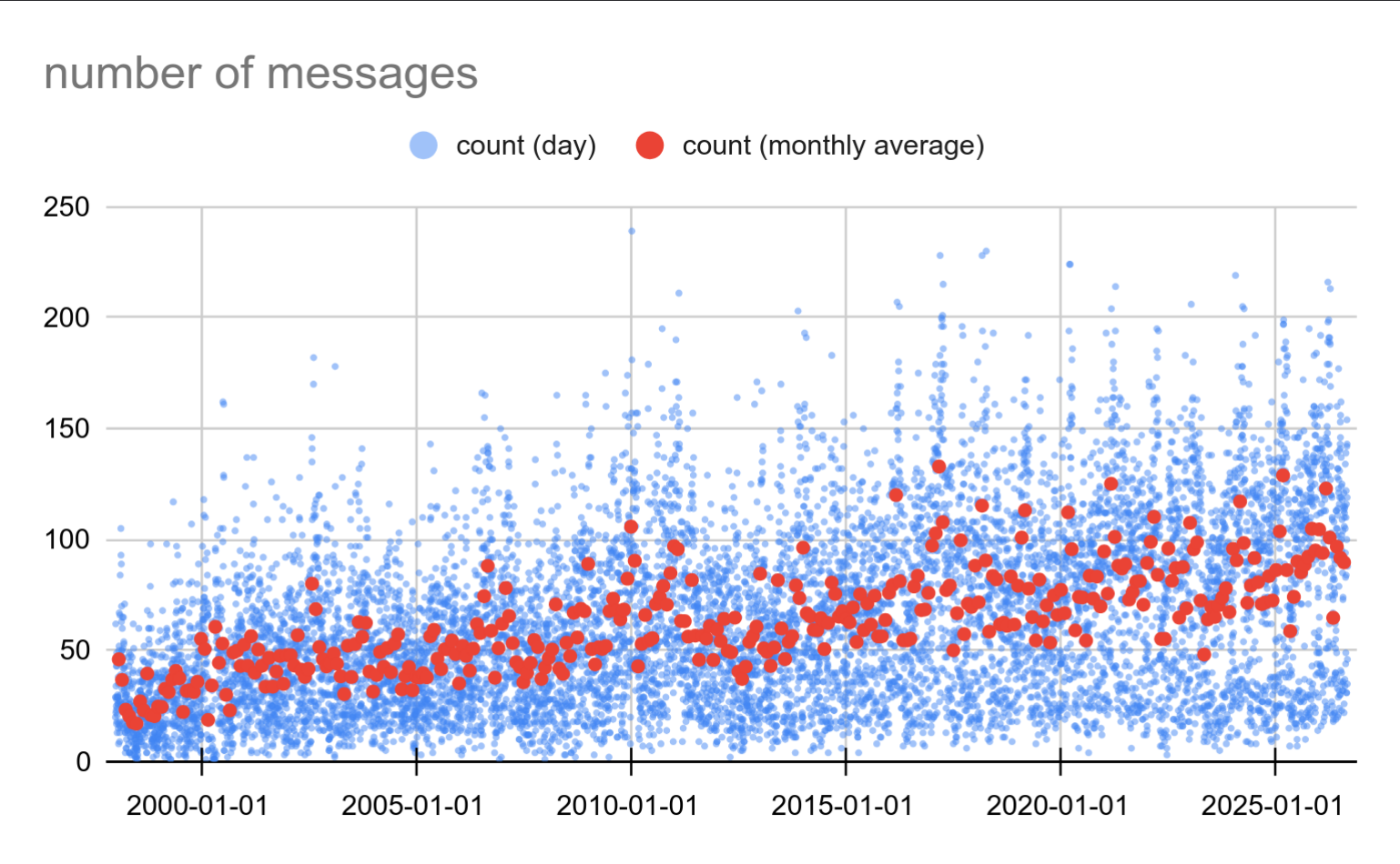
That’s pretty significant and consistent growth. At the beginning we had ~25 messages / day, and now we have about ~100. And there are peaks with ~200 messages per day.
It probably won’t surprise you that those “spikes” are in March of every year, which is right before feature freeze for the next major version. It makes sense that’s when the list is the busiest.
Most developers I spoke to agreed it became nearly impossible to follow all the discussions in detail, and then also do some actual work. There’s just too much happening.
It shows how important it’s to pick a good subject when starting a thread, so that people can quickly decide if it’s something they need to pay attention to.
message size
But the number of messages is just one metric. Maybe the message size changed over time? Here’s a chart with of total message size:
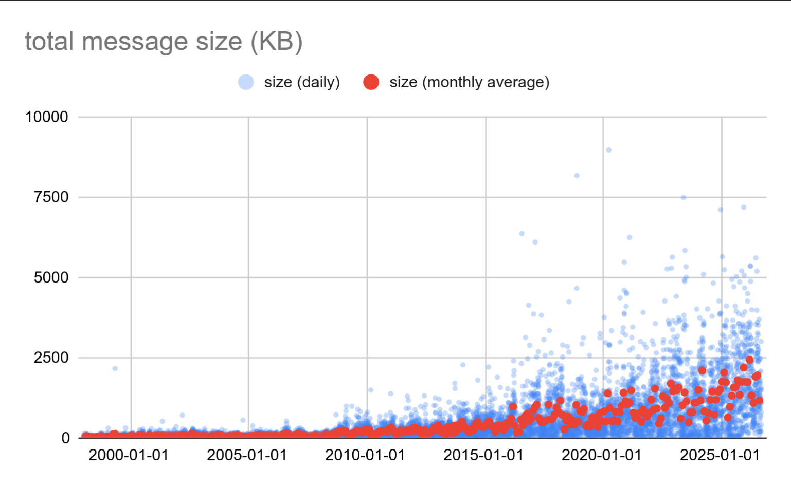
It did change! It was pretty flat up to ~2009, at which point it about doubled (from 100kB to 200kB per day). And then in ~2016 something changed again, and it gradually grew to ~2MB/day.
What about body size, without the attachments?
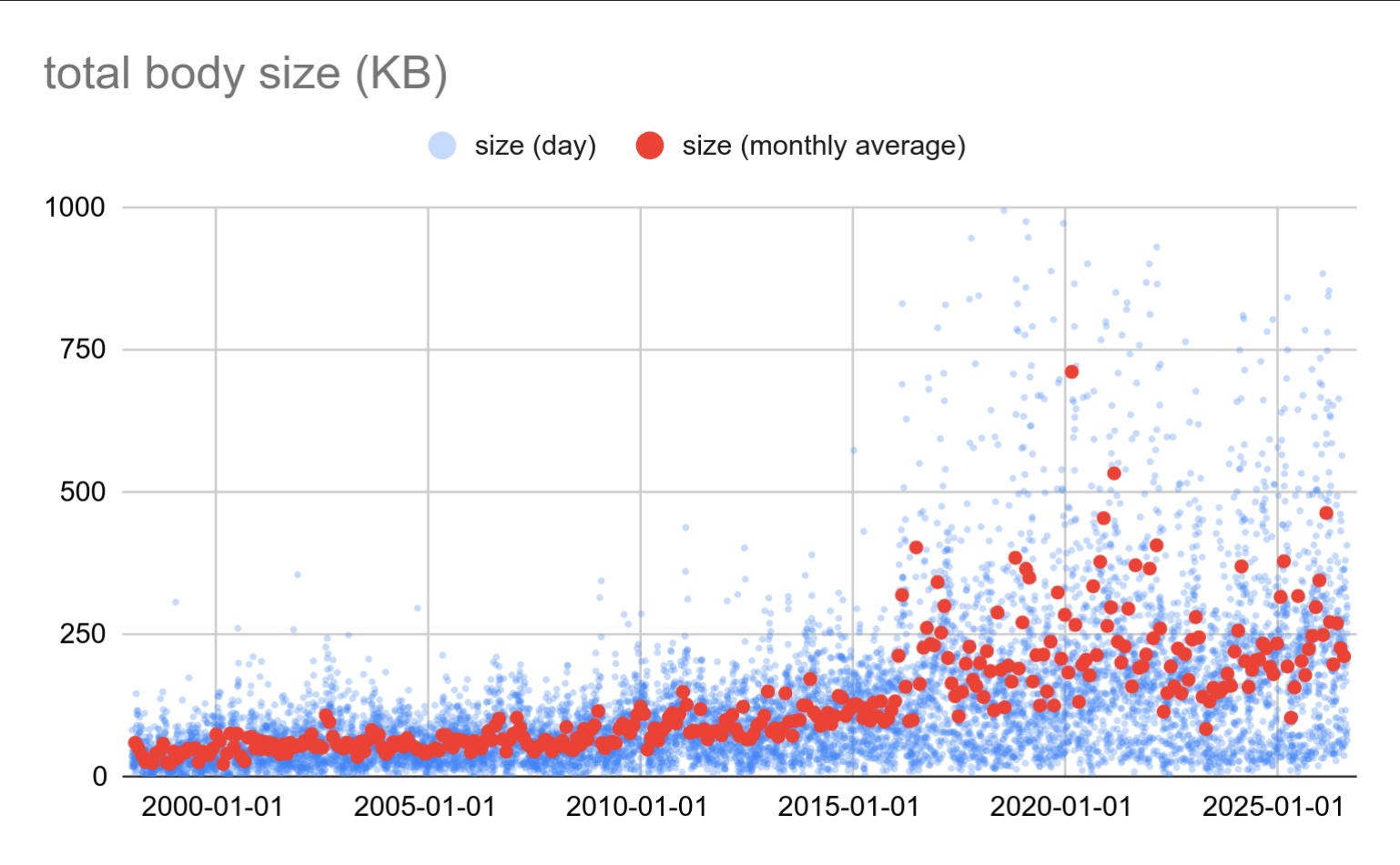
The numbers are lower (of course), but the pattern changes in a similar way. The change in 2016 is much more visible too, with the attachments filtered out.
What changed? It’s impossible to say for sure from the data, but it aligns with important commitfest dates. The very concept of a commitfest was introduced in 2008, and the original “commit fest app” was deployed in 2015. Right before the two changes. Could be just a coincidence, of course.
attachments
Speaking of attachments, did the attachment size change? Yes it did!
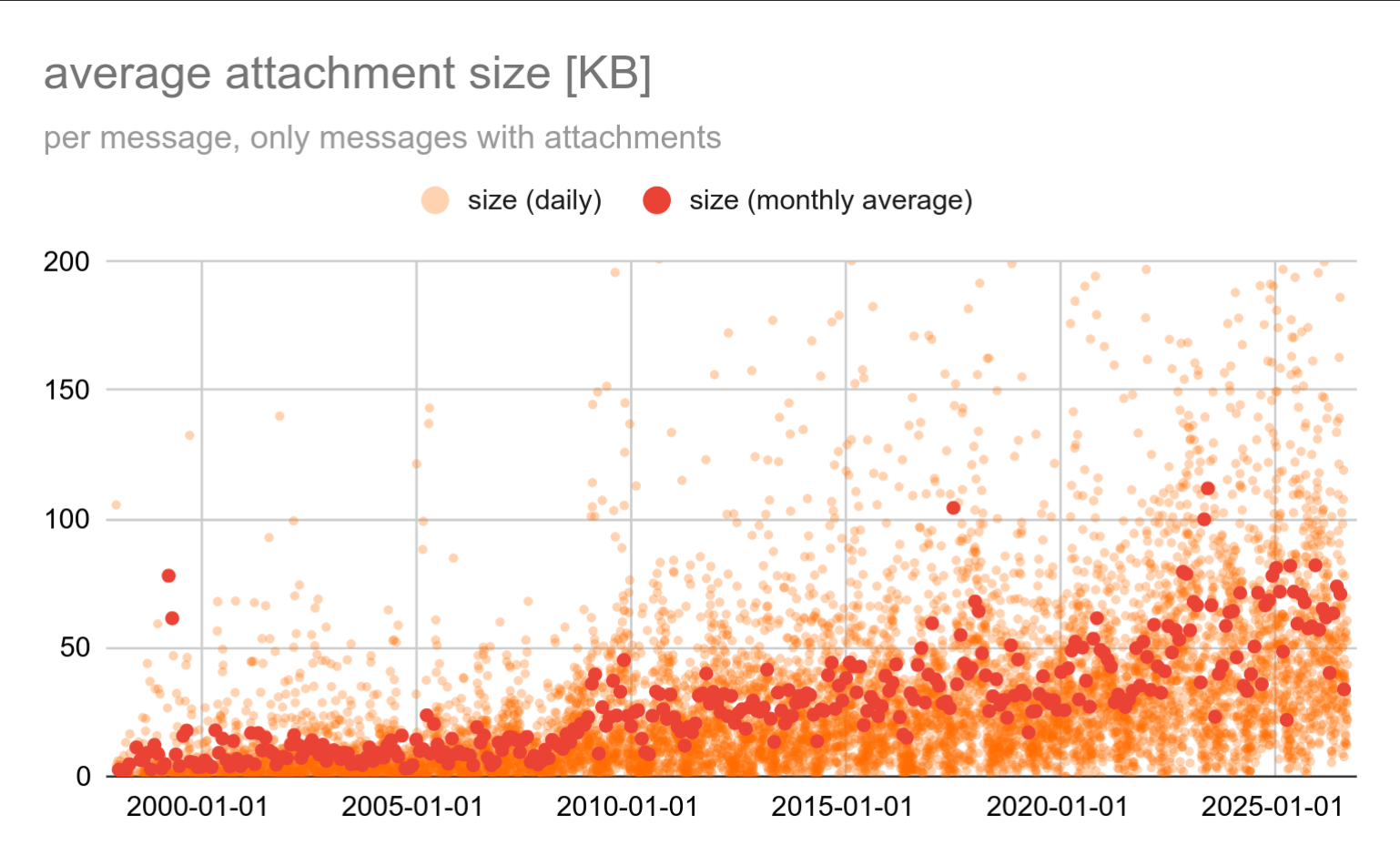
We started at ~10kB per message, now we’re at ~80kB. This is the size of attachment(s) “per message”, considering only messages that do have attachments.
This may approximate the size of submitted patches to some degree, but it’s not the most accurate metric. We’re sending all kinds of other files to the mailing list, not just patches. I’m regularly sharing PDFs with benchmark results, and those can be quite large, which skews the results.
Patches are likely the most common attachments, so how many messages do have an attachment? The following chart shows the fraction of all messages with at least one attachment (which is likely a patch):
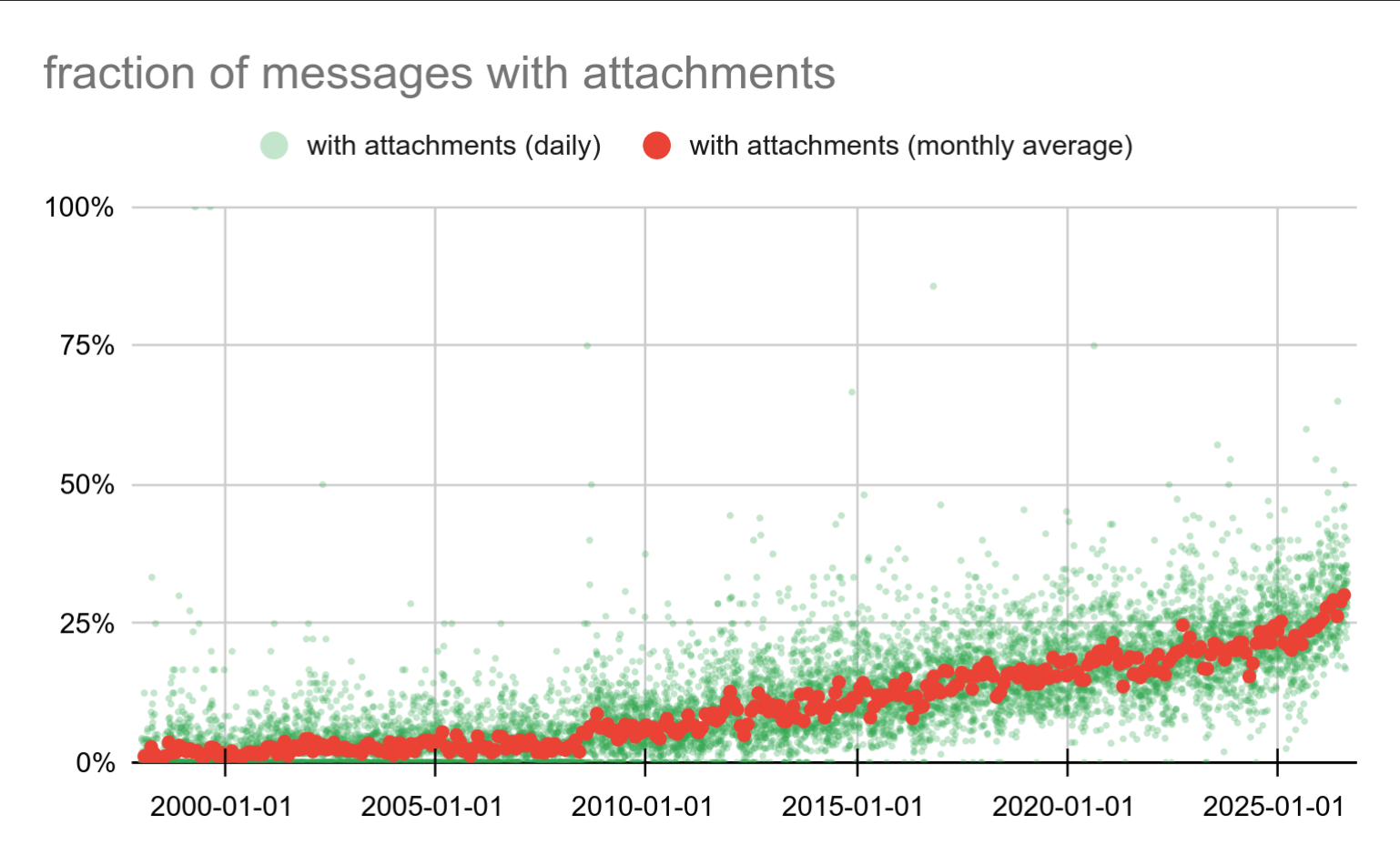
That’s a pretty massive increase. Up to ~2008 only about 5% of messages had a patch attached. Now we’re at ~25%.
If a message has attachments, how many does it have? I see this as one way to measure the complexity of a patch - we’ve learned that once it becomes too complex, it’s better to split it into multiple pieces.
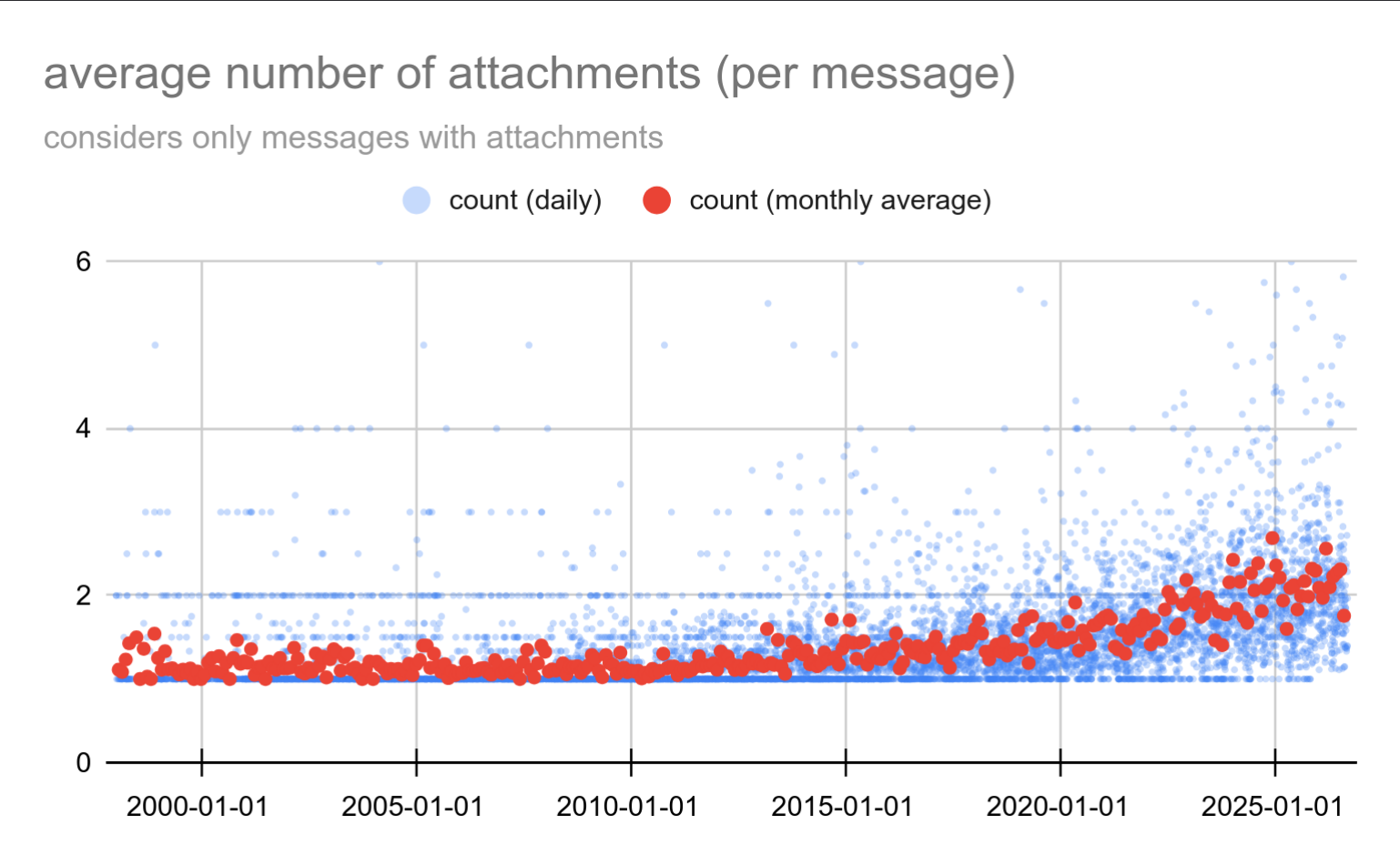
Up until 2010 most patches had either 1 or 2 parts - that’s visible as two clear “lines”. Then we started to do split patches into pieces, and now we’re at ~1.6 on average.
Most patches still have just a single part (~90%), and 99% patches have less than 10 parts. But there’s a long tail of much larger ones, and we have patches with 76 parts. (FWIW I very much prefer this to one huge patch.)
git
Let’s look at some git commit stats. There are far fewer commits than messages on the mailing list, so charts in this section will show data per week. The per-day resolution was far too noisy to be useful.
Here’s a chart with the number of commits per week:
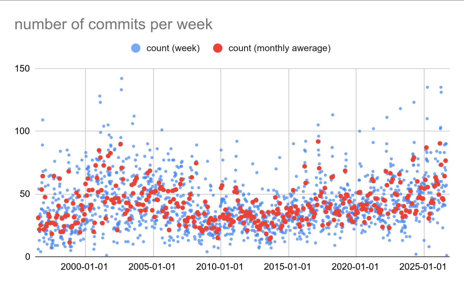
We’re doing ~50 commits per week, give or take. In ~2010 we were doing maybe 25/week, and the trend seems to be a slow and consistent growth. The monthly average makes the trend a bit easier to spot. Which is good, although there’s a lot of other important details (size of commits, are they new features or fixes, …).
It however nicely aligns with the number of active committers, which also grew ~2x between 2010 and today. So maybe that’s working as expected.
It’s interesting we did about the same number of commits up until early 2008, and then it went sharply down. I can think of two events that might be related to this.
First, the commitfest idea was introduced ~2008, and the first commitfest aligns with the drop almost perfectly.
The second option is the migration from CVS to git. I wouldn’t be surprised if this was due to CVS vs. git differences, but I have not investigated this (the less I know about CVS, the better). Plus, that migration happened in 2010, so it’s not particularly aligned with the observation.
commit size
Let’s look at some charts tracking the “commit size” (measured as the size of the diff for the commit, in KB). It’s inherently imprecise, as it depends on the diff format etc.
This is probably the place where you should stop reading if you’re sane. But if you think the number of lines is a good meaningful measure of productivity, read on ;-)
First, the total amount of patches committed per week:
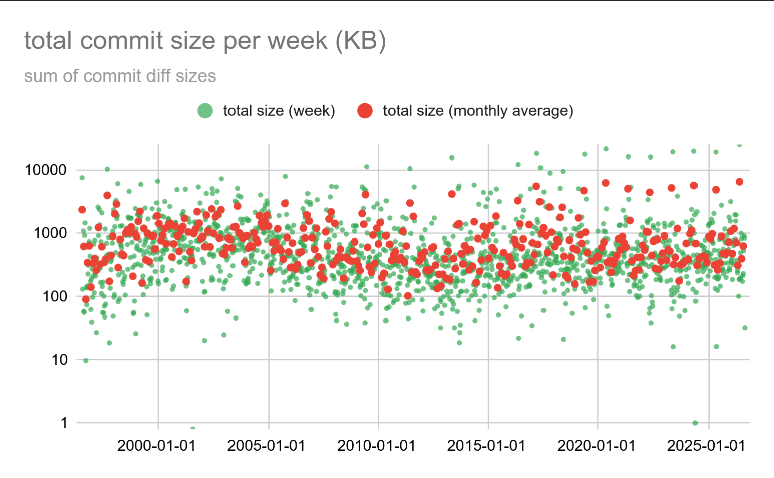
Remarkably stable, but I had to use a log-scale chart because the range of patch sizes is way too wide to visualize on a linear chart. Most of the weeks we’re at ~512KB, give or take.
But then once per year, we happen to do ~20MB in a single week. It happens once per year, in May - which means it’s not the rush before the feature freeze. If you guessed the update of translation files, you’re right!
The “per commit” average size looks like this:
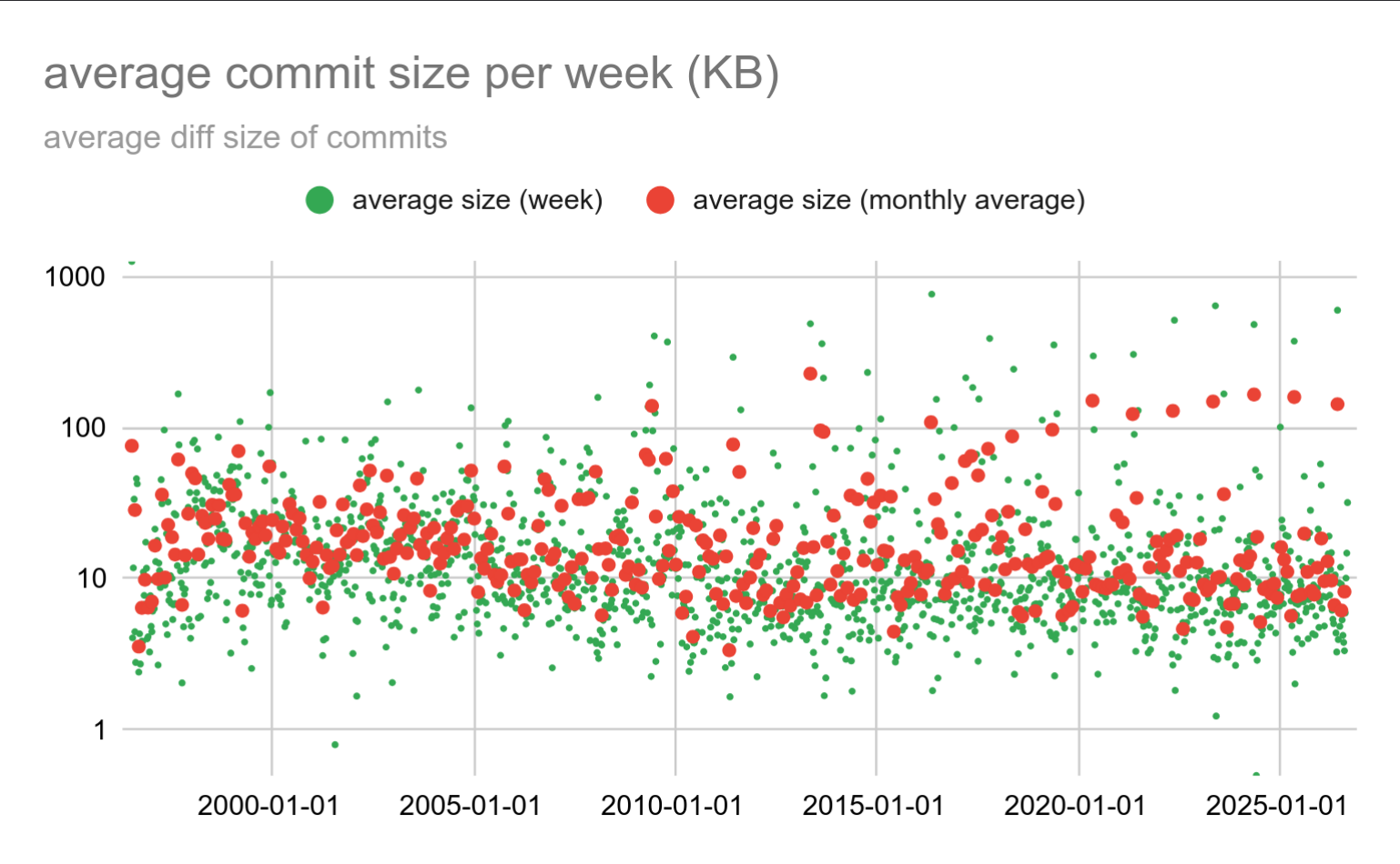
Most of the time we’re at ~10KB per commit, but the spikes due to massive patches are still clearly visible.
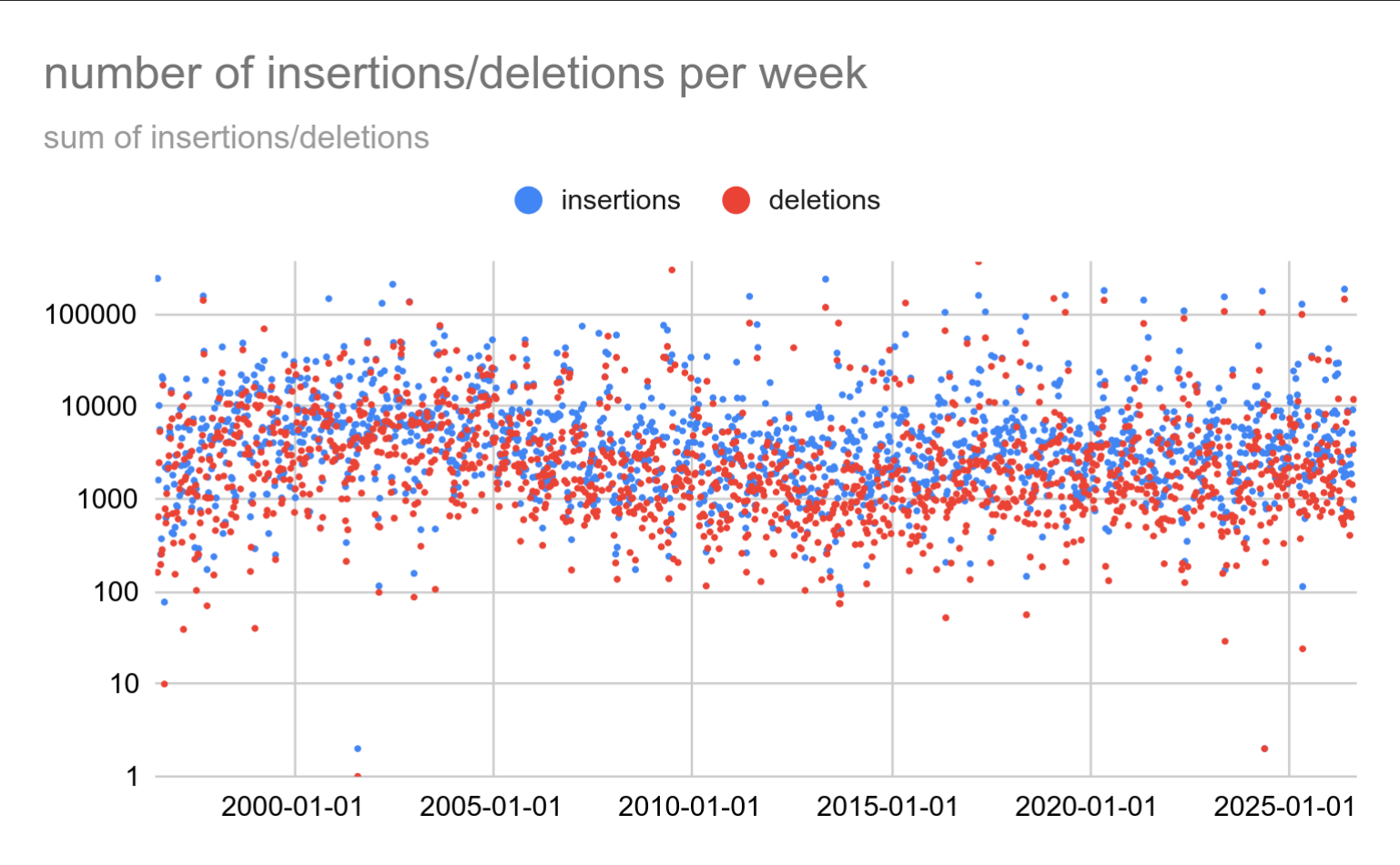
We can also visualize the number of inserted and deleted lines, both total per week:
and per-commit average of “changes” (a sum of insertions and deletions):
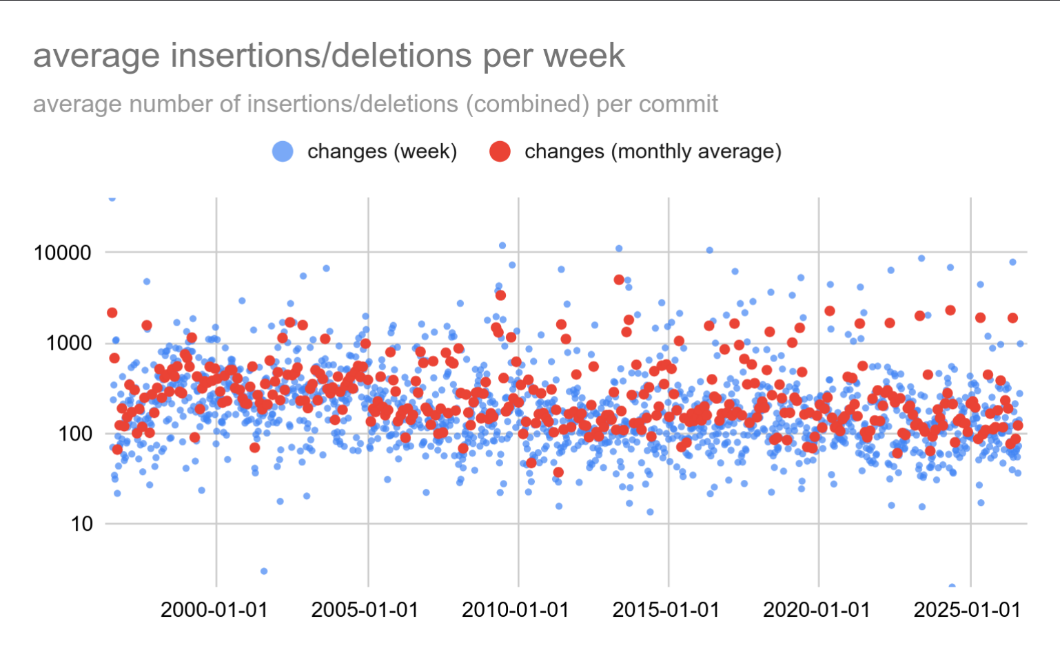
That didn’t tell us anything particularly interesting, I’m afraid. Except that the “massive” repository-wide updates (translations, in the past we also did pgindent) are nicely visible.
The first chart with insertion and deletions seems to suggest we’re consistently doing more insertions over time. You have to squint a bit to see it in the noise, but it’s there.
Between 1996 and 2026 we’ve added ~4.4M extra lines. Which may seem a bit strange, because Postgres has only ~1.5M lines of code. But notice I wrote “lines” and not “lines of code”. The number includes everything, including comments, SGML documentation, all kinds of tests, etc. If you count all of that, it’s the ~4.4M. Which makes sense. The git repository contains all changes from the start of the project, so the deltas naturally sum to the current total.
Note: This originally claimed Postgres has 9M lines, which is wrong. I don’t recall where I got that number, but I should have realized it’s way too high.
Conclusion
So that’s it.
I have a bunch more charts, but those don’t seem very interesting. I don’t want to bore you to death like Rimmer with his photo collection of 20th century telegraph poles.